Graphic trends evolve frequently, making it challenging to generate engaging and effective design content. One of the trends that have proven to be long-lasting in this challenging environment is Authentic Representation.
What is Authentic Representation?
To understand Authentic Representation let’s look into it’s two major components Ideal and reality
The vision for your company or yourself is the ideal or, in general, what you want it to be. This vision is a reflection of your ideals; yet, the reality is a distorted version of your true vision. Because your aim is to always strive to be better, there is a tension between the ideal (what you want it to be) and the actual (what it actually is). Authentic representation occurs when the two are appropriately balanced.
Authentic Representation is all about the friction between the ideal (what you want it to be) and the real (what it actually is). Only depicting the real, overlooks the ideal and only depicting the ideal ignores the real. Because of this tension, you must depict both at the same time and in order to do so, you must depict the process by which the real becomes the ideal. That is, you demonstrate how you plan to achieve your goal.

What makes a piece of design “authentic”?
Authentic design aims to cut through deception and eliminate extraneous elements. Using materials without masking them in fake textures, showcasing their strengths rather than trying to hide their flaws, is what authentic design is all about. It is about expressing function in the most efficient way possible, about believing in elegance through efficiency. Dropping the crutches of external ornament and finding beauty in pure content is what authentic design is all about. Style is important in authentic design, but it is not pursued through decoration. Rather, the content determines the beauty of the form, with style emerging as a natural result of a creative solution.
Authentic representation in graphic designing
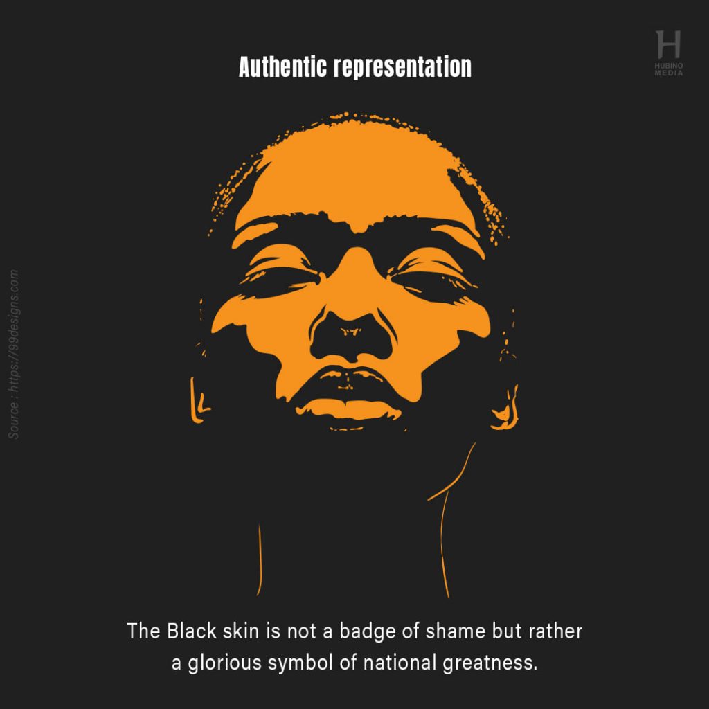
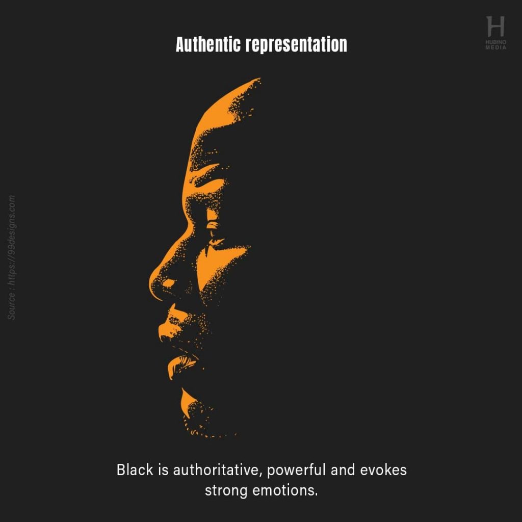
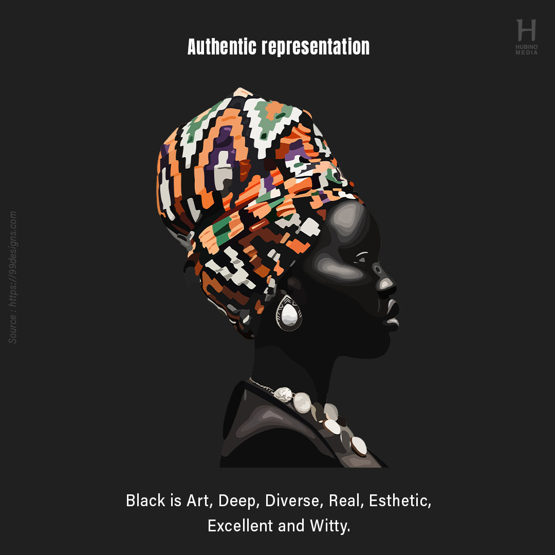
Brands are being held more accountable for their role in our society, whether it’s through placing an activist message front and centre or paying greater attention to representation. Marketers are paying more attention to representation in their work, including a larger range of races, sizes, and ages in their ads, in addition to the socially aware messages. When it comes to companies rallying around a cause, we recommend making sure the cause makes sense for your company and seems genuine.

Textures
We don’t have to imitate textures like metal, wood, or leather. They aren’t made of the same stuff as a digital interface, so pretending they are makes no sense. This isn’t to say that a design should only have plain flat background colours; rather, it means that we shouldn’t try to imitate or be limited by real-world textures.
Colours
Because it’s all about balancing the ideal and real, ask yourself these six questions to get started:
Is my brand masculine or feminine in nature?
Is my company’s tone lighthearted or solemn?
Is my brand a high-end or budget-friendly option?
Is my brand contemporary or traditional in nature?
My brand’s age: Is it young or mature?
Is my brand obnoxious or understated in terms of energy?
Your responses will offer you an idea, and you can then pick a color palette that suits you best.
If there’s one thing that design should avoid, it’s repetition. Various cultures, skin tones, ages, and identities are highlighted to demonstrate how diverse people are and how diverse our planet is. The trend is to use images of real people with their own quirks, flaws, and uniqueness, to create designs that are authentic and truly one-of-a-kind.
Authentic representation is a reflection of one’s values and ethics, and it requires accurately portraying oneself. It’s vital that your business interacts with clients, and today, ethnic and cultural diversity is a popular way to do so. As customers demand more accountability from businesses, multiple brand identities may emerge.
